3–5% Positive Reply Rate: Cold Email Metrics B2B Teams Need in 2026
B2B cold email benchmarks for 2026: why positive reply rate matters, how Apple MPP skews opens, and which metrics actually predict pipeline.

3–5% Positive Reply Rate: Cold Email Metrics B2B Teams Need in 2026
Positive reply rate is the number to build your outreach program around, not open rate or total replies. Deliverability and follow-up cadence swing those numbers more than subject lines ever will, and open rate has become close to useless as a health check.
TL;DR:
- Positive reply rate, not open rate, should guide outreach success, with an average of 3.7% and top performers reaching 8 to 12%.
- Open rates are now unreliable due to Apple’s Mail Privacy Protection, making deliverability signals a better indicator of campaign health.
- Tailored list targeting, proper domain warmup, and multi-step follow-up sequences are the most effective ways to boost reply rates.
- Filtering responses to distinguish genuine interest from autoresponders or unsubscribes is essential for accurate metrics and pipeline prediction.
- Building a dashboards that track reply, deliverability, and conversion data across platforms helps maintain campaign health and set realistic targets.
Table of Contents
- What Are the Key Cold Email Metrics and Their 2026 Benchmarks?
- Which Cold Email Metrics Actually Move Pipeline?
- How Do You Track Cold Email Metrics Accurately?
- What Actually Improves Reply Rates: Deliverability, Lists, and Follow-Ups
- How Should You Build a Cold Email Metrics Dashboard?
- How Do You Set Realistic Cold Email Targets?
- Where Do These Cold Email Benchmarks Come From?
- How LeadPilot Applies These Metrics in Practice
- The Real Lesson Behind These Numbers
- Sources
What Are the Key Cold Email Metrics and Their 2026 Benchmarks?
Every cold email dashboard tracks the same handful of numbers, but not all of them deserve equal weight. Here’s what each one actually measures and where it should land in 2026.
Open rate tracks how many recipients opened your email, at least in theory. Apple’s Mail Privacy Protection has made this metric close to decorative for a huge share of B2B inboxes, since it triggers a fake open the moment an email lands, regardless of whether a human ever looks at it. Treat open rate as a rough deliverability signal, never as a performance target.
Click-through rate (CTR) and click-to-open rate (CTOR) measure link engagement. CTR divides clicks by total emails sent; CTOR divides clicks by opens. Cold email rarely leans on links (a link in a first-touch email often hurts deliverability), so this metric matters more for later-sequence emails pointing to a case study or booking page.
Reply rate counts every response, good, bad, or automated. It’s the most commonly reported metric and the most misleading on its own, because it lumps a genuine “let’s talk” in with an out-of-office autoresponder and an angry “remove me.”
Positive reply rate filters that down to responses showing real interest, a question, a referral, or a meeting request. This is the number that should drive budget and targeting decisions.
Bounce rate measures emails that never reached an inbox.
Unsubscribe rate and spam complaint rate track how recipients push back. Complaints matter far more than unsubscribes: mailbox providers use complaint rate as a direct deliverability signal, and it’s the fastest way to get an entire domain throttled.
Conversion rate (to meeting, demo, or opportunity) is the metric leadership actually cares about, and it’s the one most teams fail to connect back to their email data.
Here’s how those metrics typically stack up across a well-run 2026 campaign:
- Open rate: varies widely and is inflated by Apple MPP; best treated as a directional indicator only
- Reply rate (all replies): moderate rates observed, varies by campaign and segment
- Positive reply rate: 3–5% average, 5–8% good, 10%+ excellent
- Bounce rate: lower bounce rates indicate healthy lists; higher rates suggest the need for list cleanup
- Unsubscribe rate: generally kept low through relevant targeting
- Spam complaint rate: kept very low to avoid deliverability issues
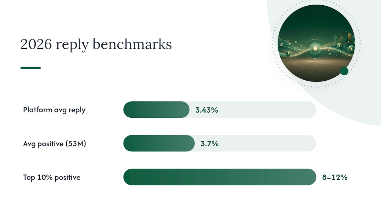
An analysis of 53 million cold emails sent in 2026 found an average positive reply rate of about 3.7%, with the top 10% of senders pulling 8 to 12%. That gap between average and top-tier senders isn’t mostly about copywriting talent. It comes down to list precision and inbox placement, two things that compound over an entire sequence.
Separate platform-wide data pegs the average cold email reply rate around 3.43%, with well-targeted, heavily personalized campaigns pushing into the high teens in narrow segments. Those numbers won’t hold for every industry or list size. A 200-contact list of hand-picked decision-makers in a niche vertical behaves nothing like a 20,000-contact blast, and benchmarks should always get read against your own list size and targeting tightness, not treated as a universal ceiling.
Cold email benchmark snapshot for 2026: average positive reply rate sits at 3.7%, the top 10% of senders reach 8 to 12%, and platform-wide reply rates (including neutral and negative responses) average 3.43%, according to Saleshandy’s analysis of 53 million emails and Woodpecker’s dataset of over 20 million sends.
Which Cold Email Metrics Actually Move Pipeline?
Open rate feels satisfying to watch climb, but it has almost no relationship to revenue.
Positive reply rate and conversion-to-meeting rate are the two numbers that actually track against pipeline. Everything else is context, not a goal.
The tricky part is that “reply rate” as most platforms report it is a garbage-in metric unless you filter it. A raw reply count typically includes:
- Out-of-office autoresponders (often 5–15% of total replies on any active list)
- Unsubscribe requests and outright “remove me” replies
- Bounced-back auto-notifications misclassified as replies
- Genuine positive responses: interest, questions, referrals, meeting requests
Skip the filtering step and you’ll chase the wrong signal.
Pro Tip: Tag every reply manually for the first two weeks of a new campaign, even if it feels tedious. You’ll build a mental model for what a “positive” response looks like in your specific market, and that judgment makes every automated filter you set up afterward far more accurate.
The fix is building a simple reply taxonomy: positive, neutral, negative, and automated. Most cold email platforms and CRMs let you tag replies this way, and once that habit is in place, positive reply rate becomes the number you report to leadership instead of a vague “engagement” figure that nobody can act on.
How Do You Track Cold Email Metrics Accurately?
Apple’s Mail Privacy Protection preloads tracking pixels the moment an email arrives in an Apple Mail inbox, registering an “open” whether or not a human ever reads the message. Because a huge share of B2B recipients use Apple Mail on their phones, open rate data now runs consistently inflated, sometimes dramatically so. Treat every open rate report as a directional signal about deliverability, not a real engagement number.
Building a measurement setup that survives this problem takes a few concrete steps:
- Tag every campaign with a unique ID in your sending platform so replies, clicks, and conversions trace back to the exact sequence and variant that produced them.
- Sync reply and meeting data into your CRM rather than trusting your email tool’s own dashboard. A CRM tied to actual pipeline stages tells you which campaigns produced revenue, not just replies.
- Log conversions as server-side events where possible (a booked call, a signed deal) instead of relying only on link clicks, which undercount because many prospects reply directly instead of clicking through.
- Use link clicks as a secondary signal only. They’re useful for measuring content interest in later sequence steps, not as a primary KPI.
- Monitor bounce and complaint rates daily during the first two weeks of any new domain or list, since problems compound fast and are much easier to fix early.
Here’s how the core tracking layers typically map to tools:
| Tracking layer | What it measures | Common tool type |
|---|---|---|
| Sending platform | Sends, opens (directional), replies, bounces | Cold email / sequencer platform |
| Verification service | Deliverability risk before send | Email verification API |
| CRM | Pipeline stage, deal value, conversion | CRM (HubSpot, Salesforce, etc.) |
| Analytics/dashboard | Cross-source reporting, trend lines | Metrics dashboard or BI tool |
| Custom event tracking | Meetings booked, calendar syncs | No-code metric platforms |
Spam complaint rate deserves its own watch threshold. A tool like Runleadpilot can help centralize these signals so you’re not manually stitching together spreadsheets from three different platforms every Monday morning.
For teams that need flexible instrumentation without engineering resources, no-code metric platforms can map event endpoints and turn raw responses into trackable KPIs, which is often the fastest path to a single source of truth when your stack includes more than one sending tool.
What Actually Improves Reply Rates: Deliverability, Lists, and Follow-Ups
Deliverability is the gating factor for every other metric on this list. Fixing authentication and warming before touching your copy is the single highest-leverage move available to most teams, because no amount of clever personalization rescues an email that lands in spam.
Deliverability fundamentals, in order:
- Set up SPF, DKIM, and DMARC correctly on every sending domain, not just the primary one.
- Warm new domains and inboxes gradually over 2–4 weeks before ramping to full volume; a resource like Runleadpilot’s guide to warmup tools walks through the mechanics.
- Use dedicated subdomains for cold outreach so a deliverability problem never touches your primary company domain.
- Monitor complaint rates and unsubscribe links continuously, and honor removal requests immediately.
List hygiene is the second lever, and it’s where most reply rate problems actually originate. Verify every email address before sending, segment lists tightly by ICP fit rather than broad firmographics, and cap how many emails go out from a single domain per day. Research on list size and targeting consistently shows that smaller, tighter lists outperform large blasts when measured by reply rate per contact, which is a hard lesson for teams used to thinking of outreach as a volume game.
Personalization works best when it’s built from a real signal rather than a mail-merge token. Referencing a funding round, a recent hire, or a specific product launch outperforms tokenized personalization by a wide margin, because it proves the sender did homework rather than running a script. Keep the message itself short, lead with relevance instead of a pitch, and end with exactly one call to action. A personalization playbook built around signal-triggered snippets tends to outperform generic “I noticed you work at [Company]” openers by a wide margin.
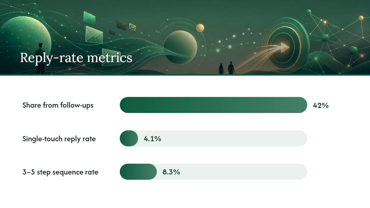
Follow-ups are where most of the reply volume actually lives. Roughly 42% of replies come from follow-up touches, not the first email, and sequences running 3 to 5 steps post reply rates around 8.3% compared to 4.1% for single-touch campaigns. The sweet spot for most B2B sequences runs 4 to 7 touches spaced 3 to 7 days apart, with each follow-up adding something new: a different angle, a relevant resource, a shorter ask, rather than a bare “just bumping this up.” A well-structured follow-up sequence is often the single highest-ROI change a team can make to an underperforming campaign.
Pro Tip: Run subject line and first-line tests one variable at a time, and don’t call a winner until each variant has at least 200 sends. Testing five things at once on a 50-contact batch produces noise, not insight. A resource on subject lines that get opened is a useful starting point for what to test first.
How Should You Build a Cold Email Metrics Dashboard?
A dashboard earns its place only if it answers one question fast: is this campaign healthy or not? That means surfacing positive reply rate, replies broken out by sequence step, deliverability signals (bounce and complaint rate), and conversion to meeting or opportunity, all in one view rather than scattered across three logins.
Useful segmentations to build in from day one:
- By ICP segment, so you catch when one buyer persona replies at 8% while another sits at 1%
- By individual campaign, so underperformers get flagged before they burn through your whole list
- By sending domain, so a deliverability problem on one subdomain doesn’t get masked by good numbers elsewhere
- By sequence step, so you know whether touch 1 or touch 4 is doing the actual work
The data sources worth connecting are your sending platform (ESP or sequencer), an email verification service, your CRM, and calendar booking data. A metrics dashboard that pulls all four into a single source of truth prevents the common failure mode where marketing reports one reply rate and sales reports a different conversion number because nobody reconciled the two data sets.
| Reporting cadence | What to review | Who acts on it |
|---|---|---|
| Weekly | Campaign-level positive reply rate, bounce trend | Campaign owner |
| Biweekly | Sequence step performance, subject line tests | Copywriter/strategist |
| Monthly | Deliverability audit (SPF/DKIM/DMARC, complaint rate) | Ops/deliverability lead |
| Quarterly | ICP segment performance, list source ROI | Sales/marketing leadership |
Set alert thresholds rather than relying on someone remembering to check. For teams managing metrics at real scale, a platform like Grafana Cloud offers the storage and visualization depth to track dozens of campaigns without the dashboard itself becoming a bottleneck.
How Do You Set Realistic Cold Email Targets?
Benchmarks only help if you know which tier your campaign sits in and what that tier tells you to fix. Here’s the practical breakdown:
Start with deliverability (check your domain’s spam folder placement and complaint rate) before touching copy. A message can be perfect and still fail if it never reaches the inbox.
3–5% positive reply rate: this is the 2026 baseline for a competently run campaign, matching the average of 3.7% found across 53 million emails analyzed. If you’re here, the fundamentals are working; the next gains come from tighter targeting and follow-up cadence.
Personalization and list precision are both working. Focus on scaling volume without diluting targeting quality.
10%+ positive reply rate: the top tier, matching what top-performing senders achieve with narrow ICPs and strong signal-based personalization. This tier is usually only sustainable on smaller, hand-researched lists, not at scale.
Run the diagnosis in order: deliverability first, then list quality, then message relevance, then cadence. And when a campaign is performing well, the temptation is to scale volume immediately. Resist it until you’ve confirmed the lift holds on a slightly larger, still-tight segment.
Where Do These Cold Email Benchmarks Come From?
The 2026 figures cited throughout come primarily from two large-scale analyses: Saleshandy’s review of 53 million cold emails and Woodpecker’s dataset spanning over 20 million sends, supplemented by Apollo’s benchmarking of well-run outbound campaigns.
A few limitations worth keeping in mind:
- These numbers reflect the platforms’ own customer bases, which skew toward teams already investing in deliverability tooling, so a random sample of all cold email sent everywhere might read lower.
- Apple MPP continues to distort open-rate data across every dataset that includes it, which is exactly why this guide treats open rate as directional rather than a benchmark to hit.
- Industry and list size both cause real variance. A 500-contact list of hand-vetted enterprise buyers and a 50,000-contact SMB blast will never post comparable numbers, even under identical copy and cadence.
Use these ranges as a starting reference, then build your own internal benchmark after 60 to 90 days of consistent sending. Your list, your ICP, and your deliverability setup will always matter more than any published average.
How LeadPilot Applies These Metrics in Practice
Runleadpilot was built around the exact problem this guide addresses: teams reporting reply rate without knowing how much of it is real. The platform researches decision-makers from actual business signals, not static lists, then drafts sequences and manages dedicated sending domains so deliverability is handled before the first email goes out rather than diagnosed after reply rates tank.
Because Runleadpilot filters and routes replies to a human team, positive responses get separated from autoresponders and unsubscribes automatically instead of requiring manual tagging. Follow-up cadence, domain warmup, and list targeting all get managed as one connected system rather than three disconnected tools each reporting a different number.
For teams tired of reconciling reply rate numbers across a sequencer, a CRM, and a spreadsheet, a managed cold email lead generation approach removes that reconciliation problem entirely. Prospects can build a free campaign preview to see what Runleadpilot’s targeting and messaging would look like for their specific ICP before committing to a managed plan, a useful way to sanity-check assumptions against the benchmarks in this guide.
The Real Lesson Behind These Numbers
Most cold email advice still treats open rate like it means something, and that’s the biggest gap between conventional wisdom and what actually predicts pipeline. Apple’s mail privacy changes made that number close to theater for a huge share of B2B sends, and teams that keep optimizing subject lines against it are chasing a ghost.
What the data actually supports is boring but true: deliverability and follow-up cadence outperform clever copy almost every time. A 3 to 5 step sequence on a warmed, properly authenticated domain will beat a brilliant single-touch email sent from a cold inbox, every time, and by a wide margin.
If you take one thing from this guide, filter your replies before you report them. Positive reply rate, measured honestly, is the only number that tells you whether the campaign is actually working or just generating noise that looks like progress.
— Harsh